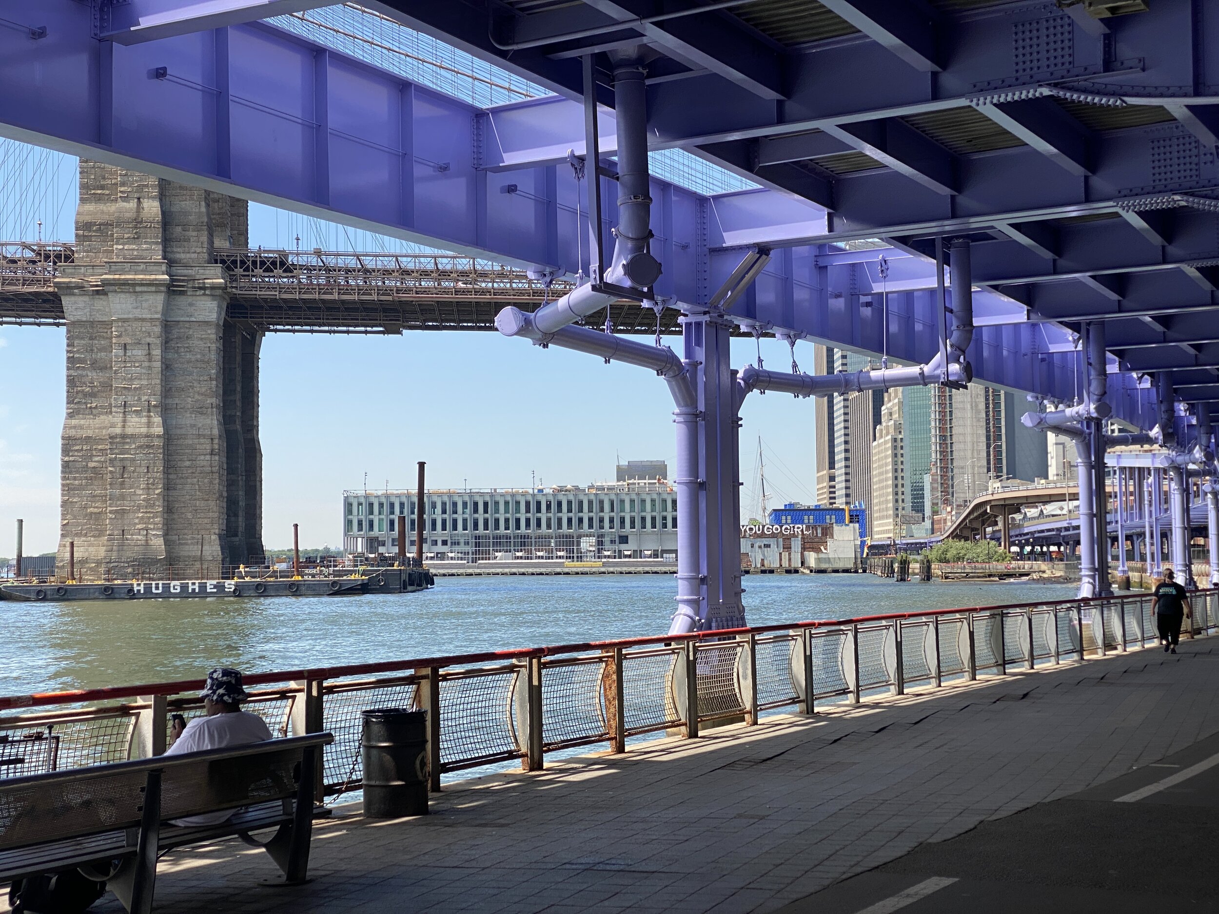
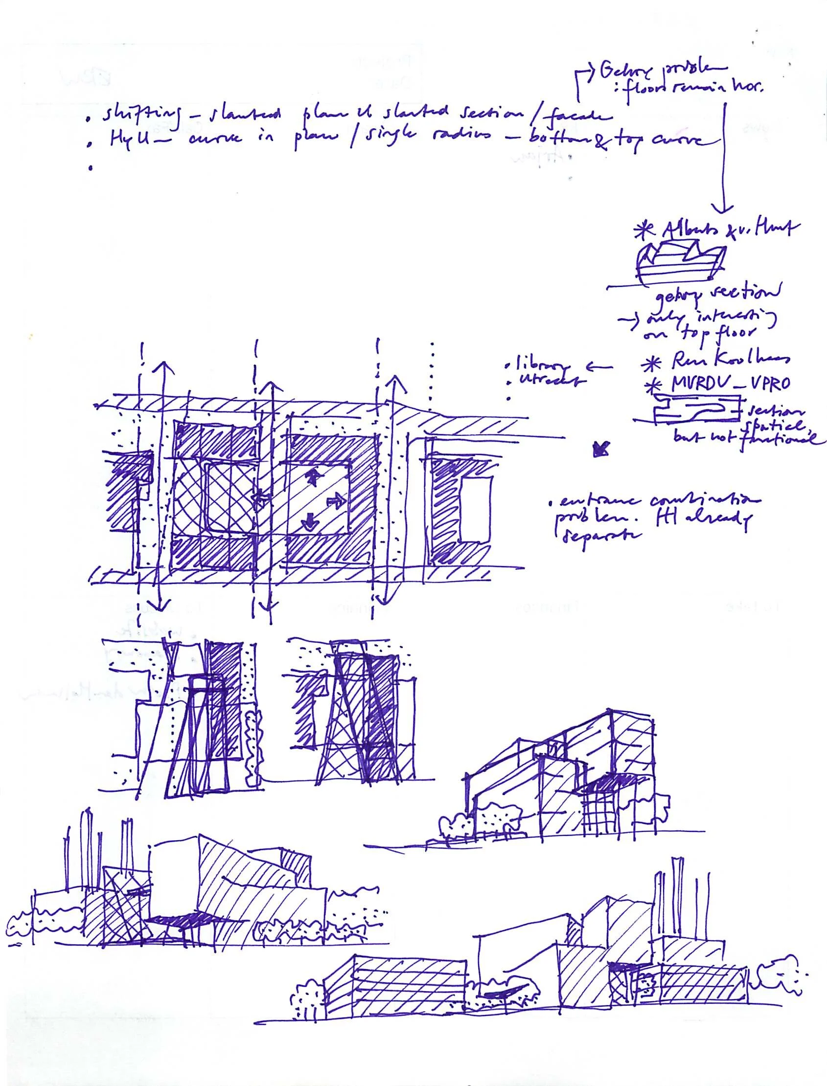
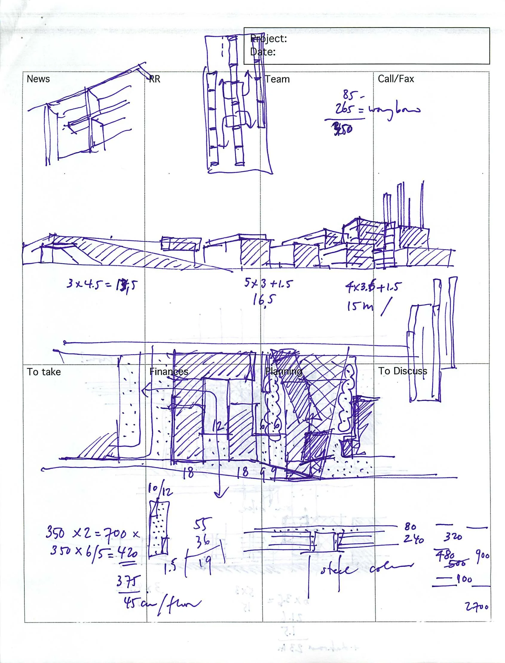
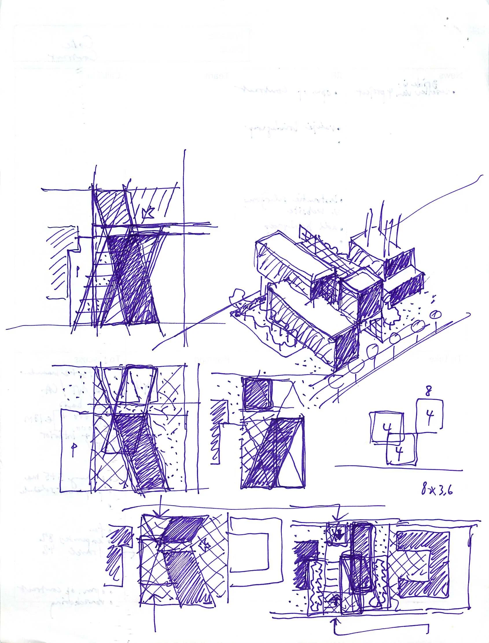
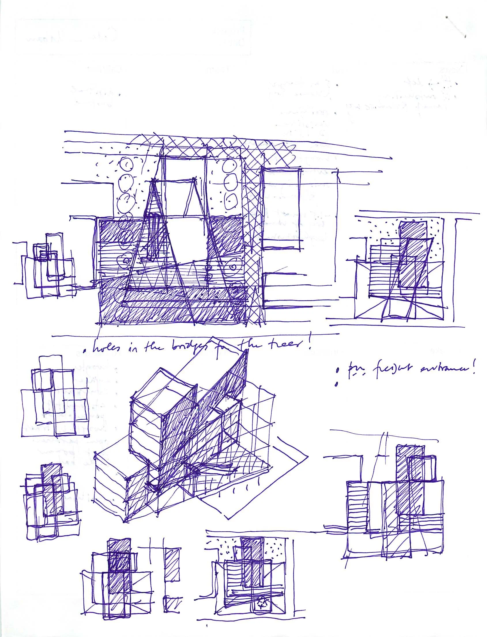
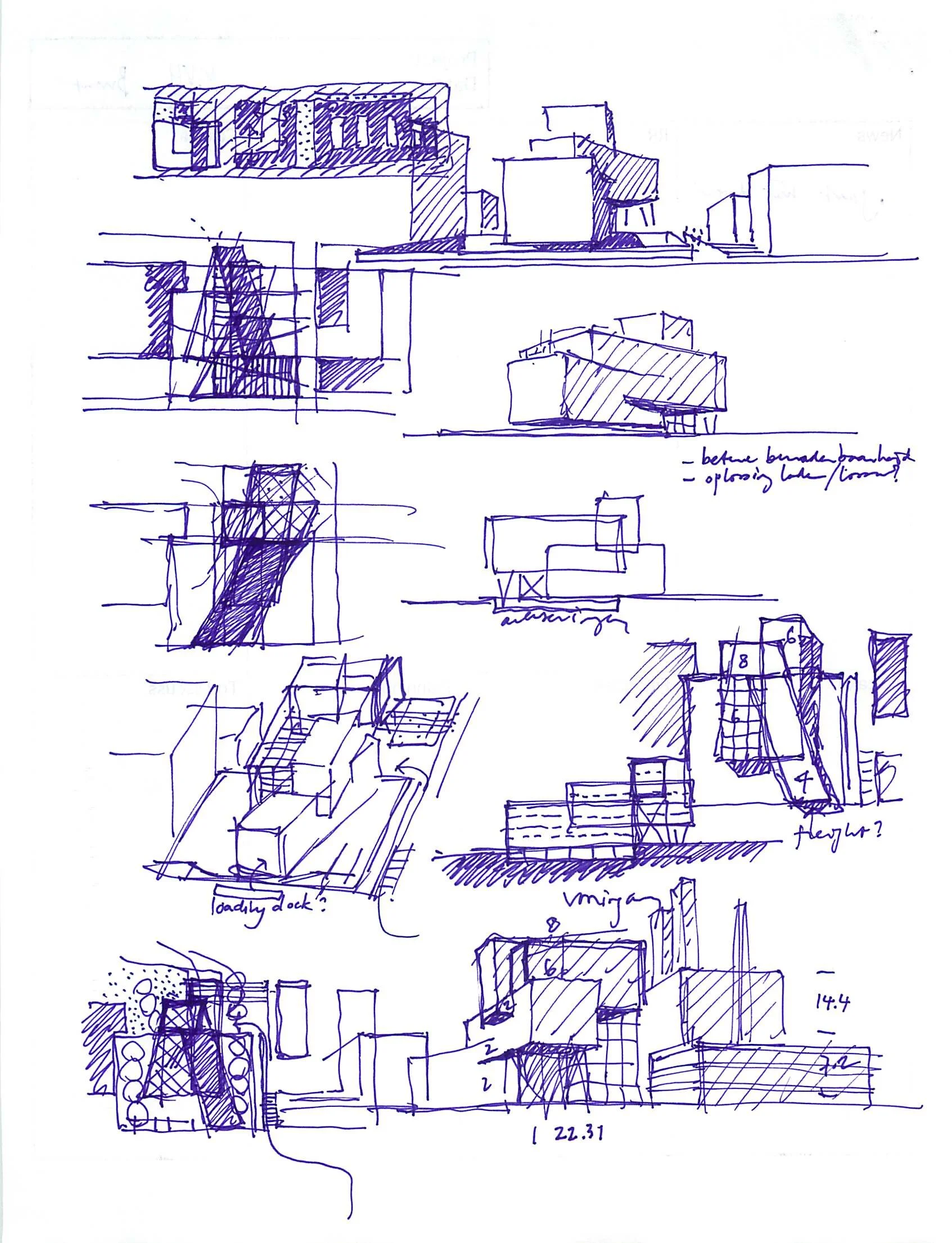
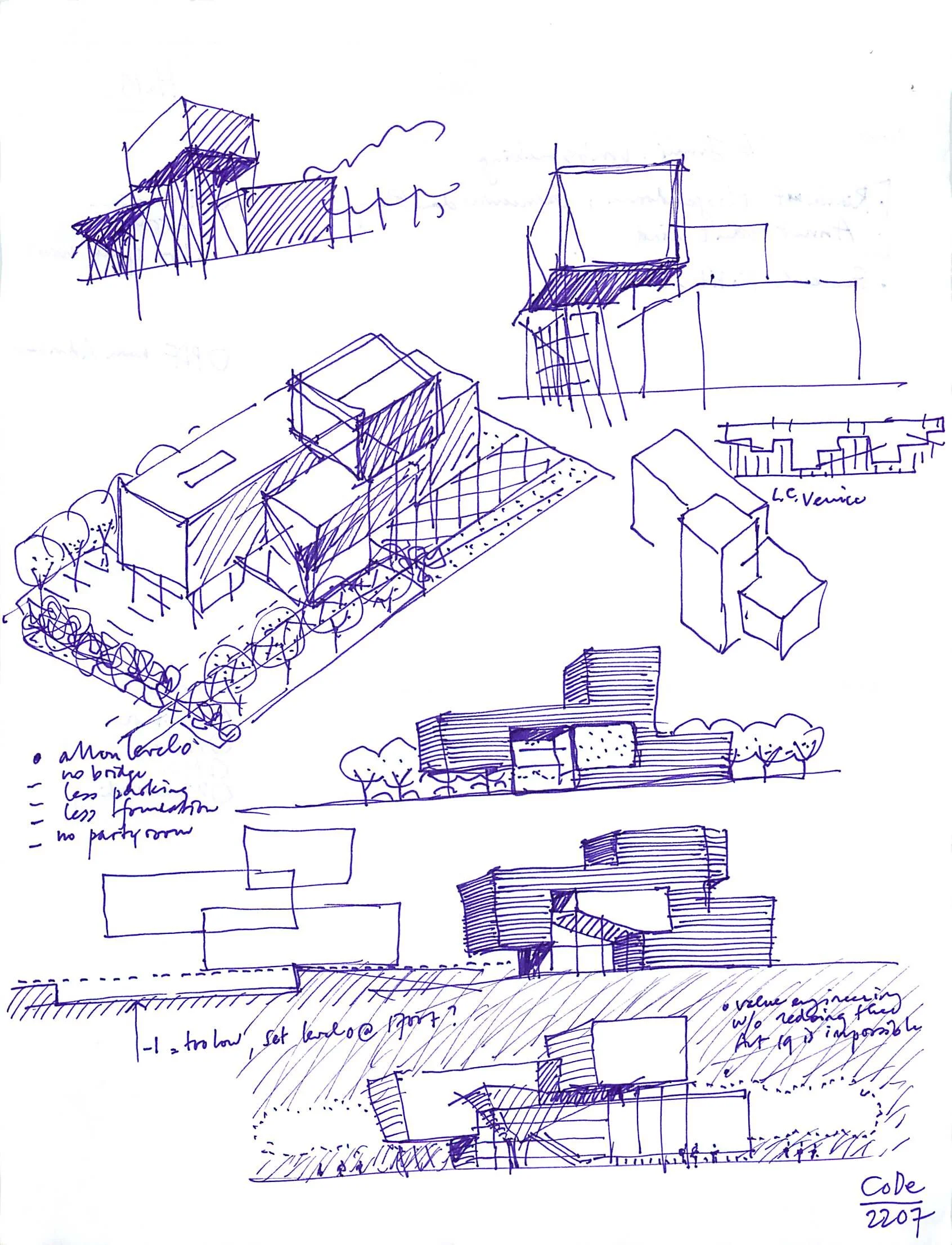
The result from the sketches from the archives. Never built Utrecht...5
Bob Evans' desk
Had a magazine page of Bob Evans' desk for a long time: My inspiration for an exec's media office design. The kid stays in the picture! #OriGersht #YvesBehar #Moooi #Vitra #ArteCuoio #Galaxy
A sketch a Day from the archives. Never built Utrecht...4
A sketch a Day from the archives. Never built Utrecht...3
A sketch a Day from the archives. Never built Utrecht...2
A sketch a Day from the archives. Never built Utrecht...
Tried this 11 years ago. Now a familiar concept. The render is very OMA-ish or MVRDV...
hello kitteh
Working late and missing my kittehs…this was a classic Champagne move
Sketch from the west point of Sugar City...
Candy color
I am thinking about what happens when the color swatch is too small…
Closing off the archive sketches of InHolland University with a picture of the 3D model....
Back into the archives for a Sketch-a-Day series one decade ago: early concept sketches of the InHolland University in Delft...4
I didn't know that we made this many volume studies....
Back into the archives for a Sketch-a-Day series one decade ago: early concept sketches of the InHolland University in Delft...3
Thinking about the space between Cezanne's apples.
Back into the archives for a Sketch-a-Day series one decade ago: early concept sketches of the InHolland University in Delft..2
Lemniscatus
Security barriers don't need to be aggressive or a DOT poseur as planter- they can be NY Tough, but soft and lemniscatus. Thank you artist Gina Miccinilli and The Compleat Sculptor for giving me hope and a killer scrabble word.
InHolland University Delft
Back into the archives for a Sketch-a-Day series one decade ago: early concept sketches of the InHolland University in Delft
InHolland University Delft
The program for the InHolland University building was housing two department and administration. Departments were growing and shrinking so we used overlapping volumes an then shifted the floor plates in a way that every corner would be an open double height space for individual study. As usual, we were thinking in volume and not floor plan: If you want to cram in more people on a floor you better provide more height to avoid the feeling of overcrowding. The main auditorium is accessed from the floor that overlaps both departments.
Looking for practical solutions to make the glass panes flexible in the corners. With Ulrich Knaack
InHolland University Delft
Mockup at Octatube of the thinnest double glass facade in the world. The Kevlar tubes are for compression, the Aramid cables are for tension. The whole structure fits in the cavity of the double glass! The Aramid cables have 8 Ton of tension per cable, but, unlike steel cables, they never have to be re-tensioned. With Peter van de Rotten...


